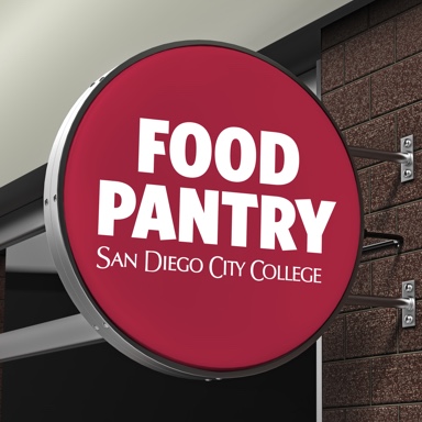
This project presented a unique challenge: to appeal to local business owners, school faculty, and students. The Food Pantry currently provides 450 meals a week and is not seeking more people to use its service but does need more donations.
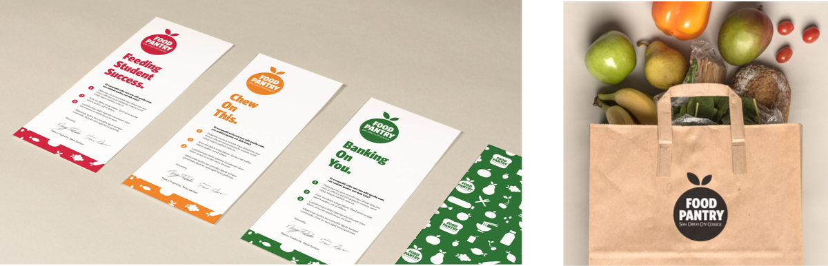
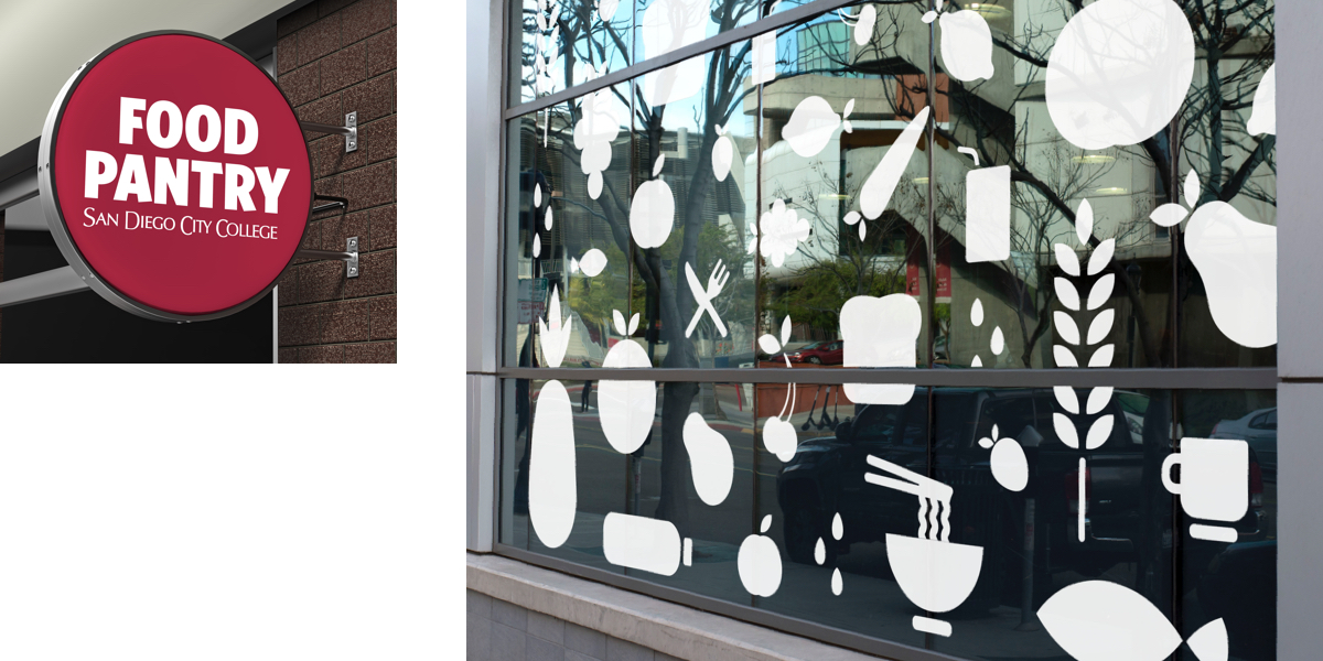
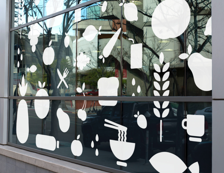
A secondary goal was to create a system that could be used with the Food Pantry’s sister store, Fantastique, a used clothing shop. A bold style was chosen for the logo and brought into the icon system. Geometric shapes were utilized to create a timeless and professional look that would establish trust and continue to engage with its current clients, the students.
The City College colors of burgundy and gold and typeface, Whitney, were natural choices to stay aligned to the existing overall brand.
Art Directors
Sean Bacon, Candice Lopez
Category
Branding
Deliverables
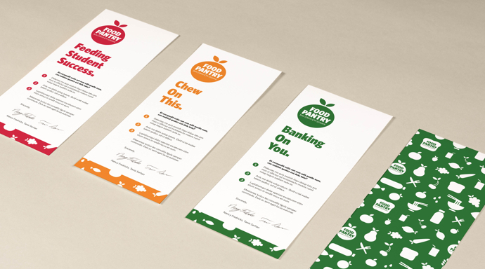
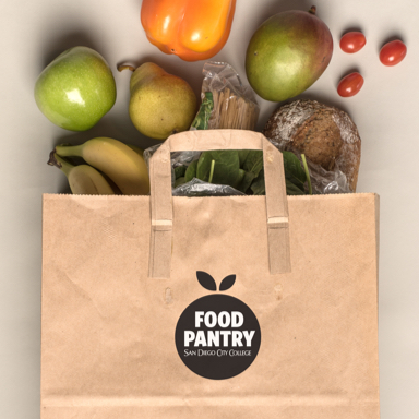
Logo, Environmental Graphics, Marketing Materials
The first icon was created with geometric shapes, many subsequent icons utilized the same initial shape and process.