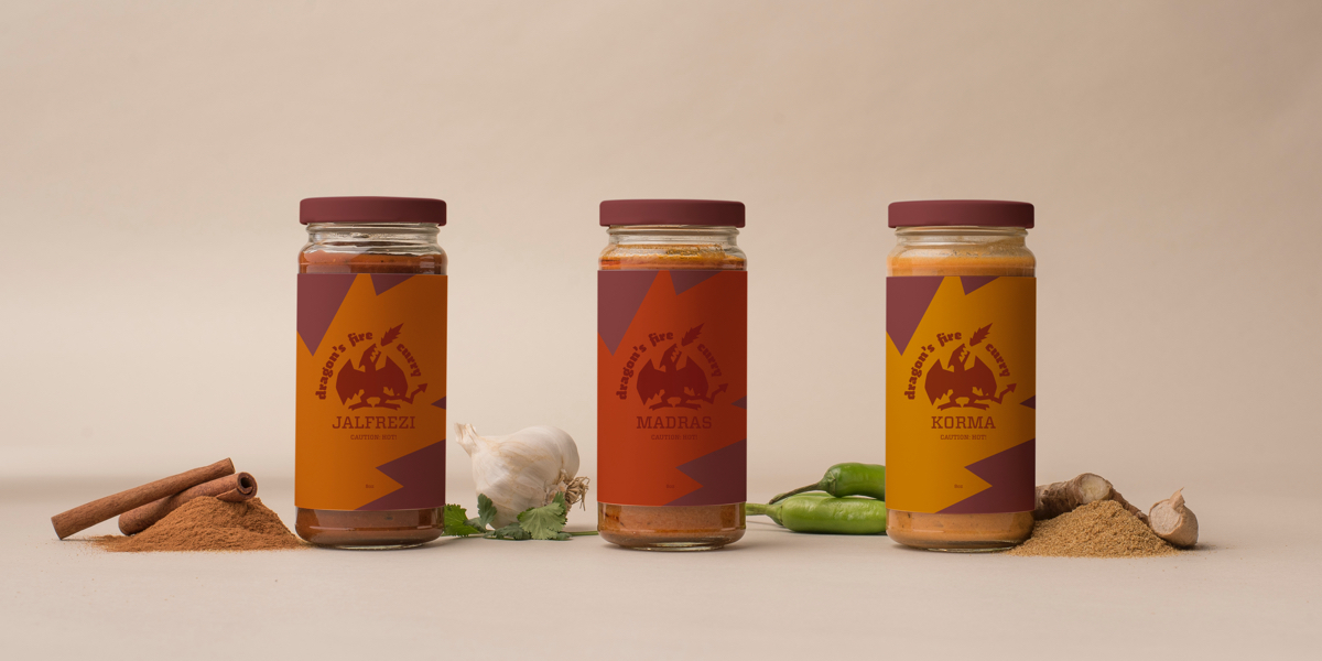
Based in London, the Indian-English founders sought to integrate the best parts of both cultures and appeal to a millennial target audience which has a growing interest in cooking.
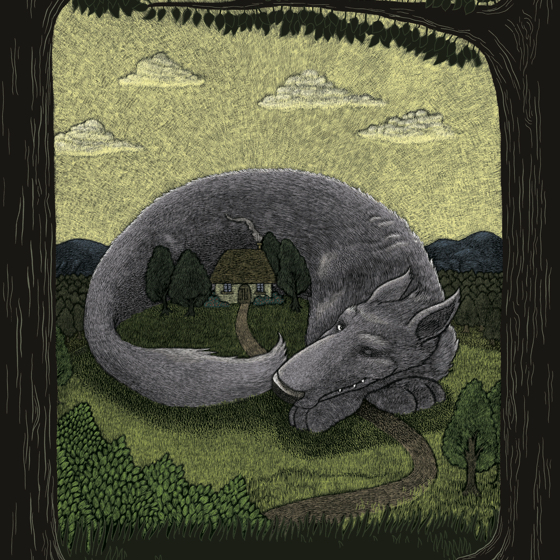
Curry is one of the most beloved dishes in England so differentiation was crucial. The use of unique, quirky illustrations were leveraged to express the uniqueness of the brand and engage with the audience. Fakir was a natural pair for the illustrations due to its matching offbeat letterforms. Bright colors were chosen for energy and prominence.
Art Director
Sean Bacon, Bradford Prairie
Category
Food
Deliverables
Logo, Packaging